Line of best fit.
Here in this blog entry, we will show you how to properly find the line of best fit.
Firstly, You need your data points, preferably set up in a nice chart like this:
| Sandwich | Total Fat (g) | Total Calories |
| Hamburger | 9 | 260 |
| Cheeseburger | 13 | 320 |
| Quarter Pounder | 21 | 420 |
| Quarter Pounder with Cheese | 30 | 530 |
| Big Mac | 31 | 560 |
| Arch Sandwich Special | 31 | 550 |
| Arch Special with Bacon | 34 | 590 |
| Crispy Chicken | 25 | 500 |
| Fish Fillet | 28 | 560 |
| Grilled Chicken | 20 | 440 |
| Grilled Chicken Light | 5 | 300 |
 Then, You can prepare a scatter plot of the points. In this demonstration, a piece of spaghetti was used to create the straight line, like so.
After that, you should pick the two best points that follow the trend of all the points and set the spaghetti, or best fit line, through them.

For this example, I chose points (9,260) (30,530)
You then can calculate the slope through your two points, like this
.
 (Note the answer in this image was rounded to the third decimal place, and is usually unnecessary )
You are then able to write the equation of a line!

You can now predict how the line would continue to grow, good job!
Here is a small practice quiz, to help you out if you feel like you need some extra practice the key is below:
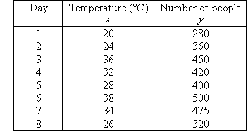
The following table describes data for the number of people using a swimming pool over 8 days in summer and the corresponding maximum temperature (in degrees Celsius) on each day.
a. Draw a scatterplot for this set of data.
b. Draw a line of best fit through the data by eye.
c. Is association positive or negative?
d. Is association weak or strong?
e. Use the line of best fit to predict the swimming pool attendance where the daily maximum temperature is:
(i) 18 ºC (ii) 30 ºC (iii) 40 ºC
The scatterplot is obtained by plotting y against x, as shown below.
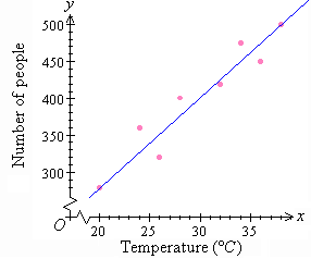
b. A line of best fit by eye is drawn through the scatterplot so that an equal number of points lie on either side of the line and/or the sum of the distances of the points above the line are roughly equal to the sum of the distances below the line.
c. It is clear that y increases as x increases. So, the association between the variables is positive.
d. The data is spread about the line. So, the association between the variables is weak.
e.
(i) When x = 18, y = 260
So, about 260 people are expected to attend the swimming pool.
(ii) When x = 30, y = 400
So, about 400 people are expected to attend the swimming pool.
(iii) When x = 40, y = 520
So, about 520 people are expected to attend the swimming pool.
daannnnggg keep up the good work bud!
ReplyDeleteA+ for dayyyz
nice looking good
ReplyDeletecool
ReplyDelete